In 2021, I led the internal design team in partnership with our external agency, Landor & Fitch, and further led implementation of a brand refresh for Nasdaq, simplifying and modernizing the visual identity to focus the brand as a forward-looking tech company. We sought to showcase our brand's humanity, global reach and purpose-driven approach to accessing capital and markets. In November of 2022, the refresh received two awards from Transform Magazine, including a Silver for Best Visual Identity from the Financial Services Sector, and a Bronze for Best Implementation of a Brand Development Project.
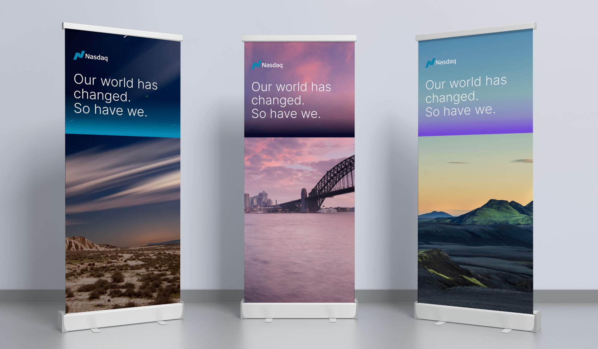
The design system was developed to highlight the "dualities" inherent to Nasdaq—a tech company for people, grounded yet optimistic, stable but nimble.
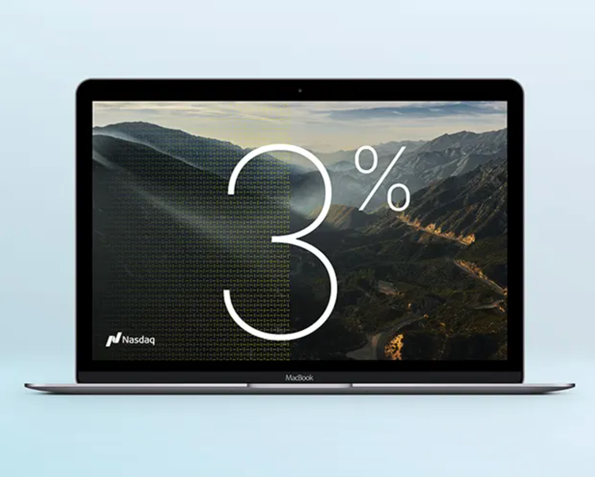
The "catalyst line" is used to highlight the dualities and bisect the compositions.

The photography style shows authentic moments, humanity and optimism.

The color palette is simple, contained, modern and tech forward.
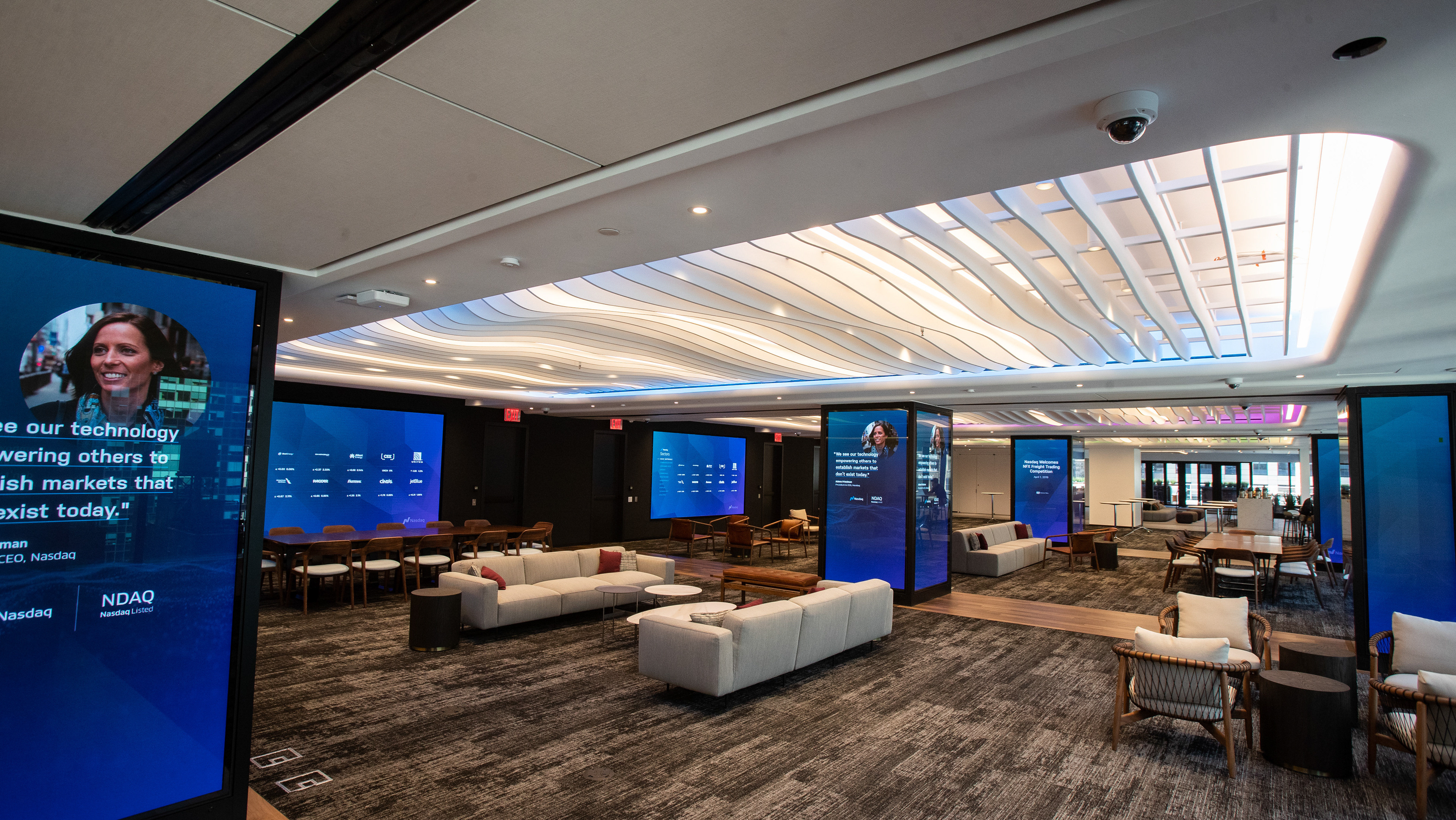
The goal with any refresh is to get at the truth of a brand while developing a visual language that is unique and ownable on all touch points. Clockwise from top left: the iconic Nasdaq Tower in Times Square, an earnings event, the in-house event space in the Nasdaq Headquarters building and an advertisement.
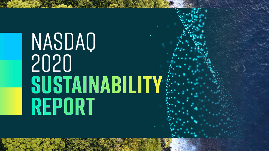
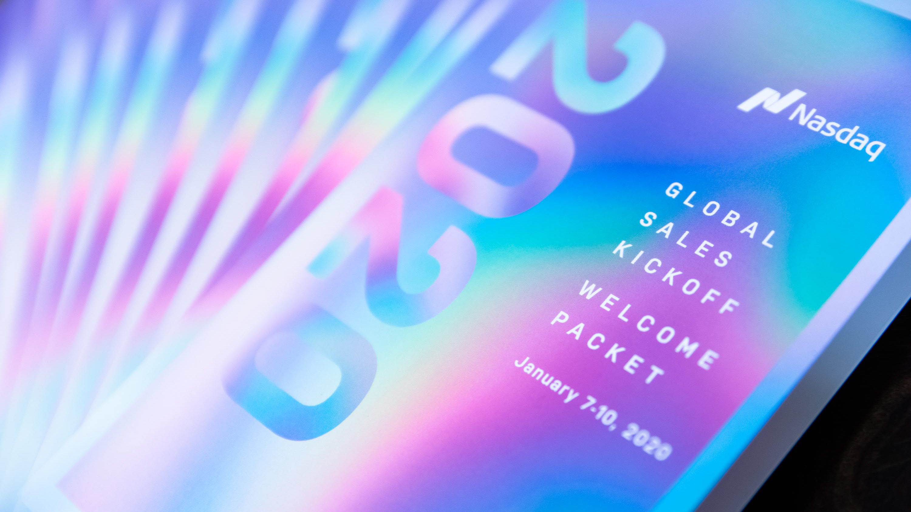
Clockwise from top left: a printed report, a social media account refresh, a Proxy Report, a social media asset and a report cover using a unique "display icon."
